Camera filters
Whether you’re a seasoned photographer or cinematographer or you’re just getting started behind the camera, we’ve got the products and expertise to help you realise your artistic vision. Our camera filters can help take your creative output to the next level.
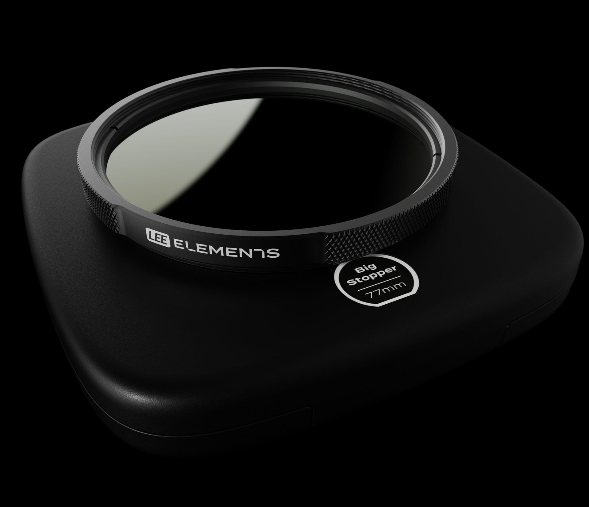
LEE Elements
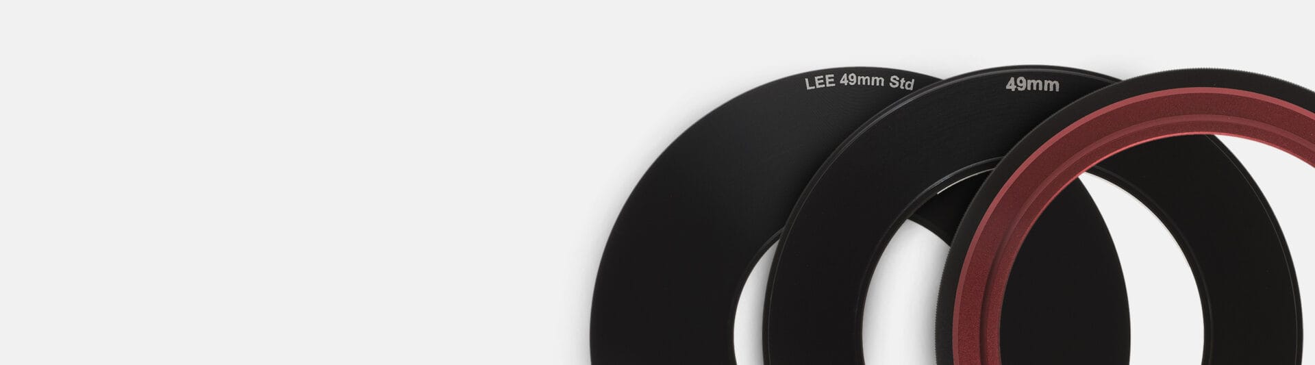
LEE Elements camera filters are available in four standard sizes — 67mm, 72mm, 77mm, and 82mm — all five filters in our LEE Elements range are designed to produce minimal to zero vignetting, even with very wide-angle lenses. Expand your creative toolset with a camera filter from LEE.
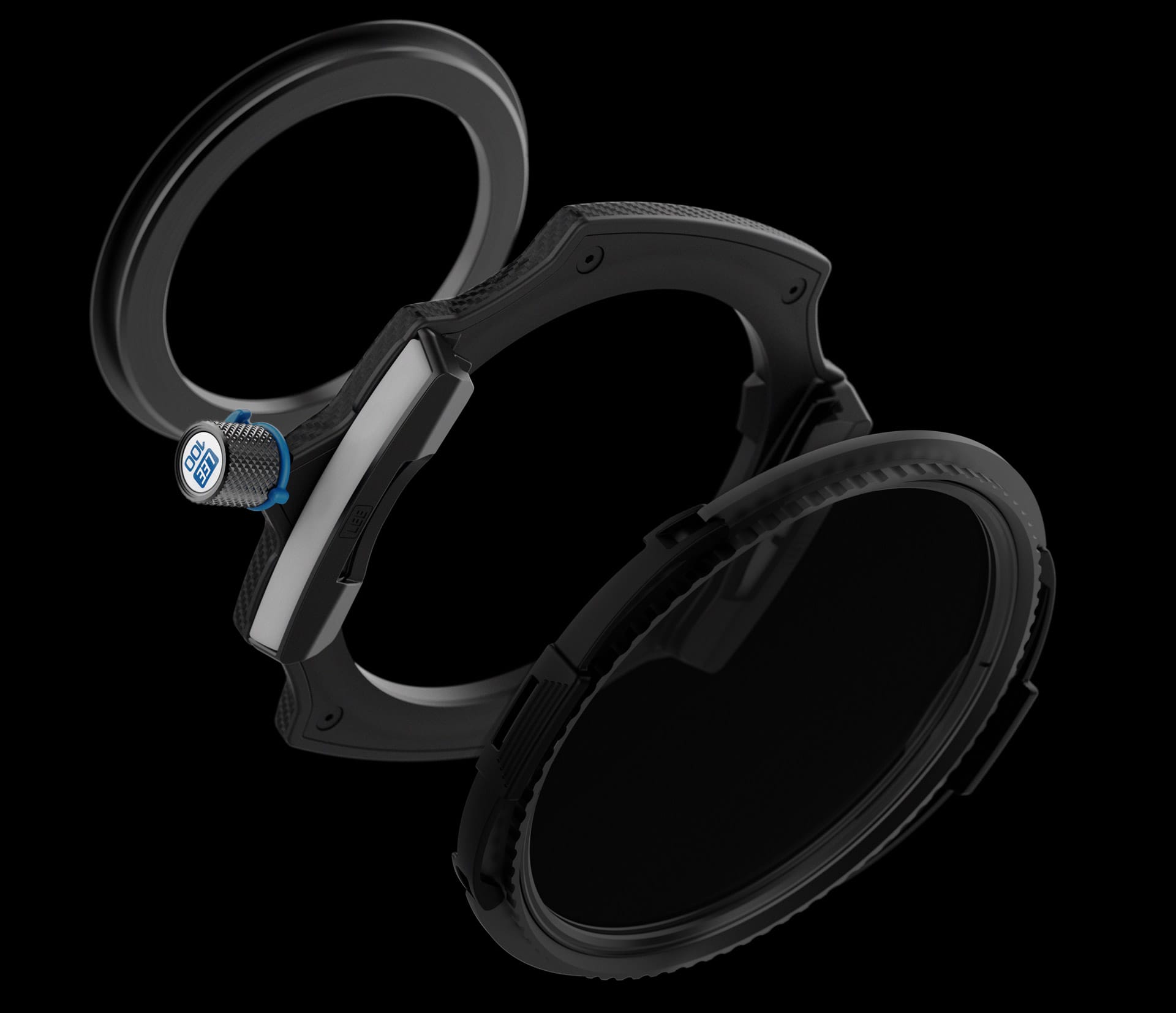
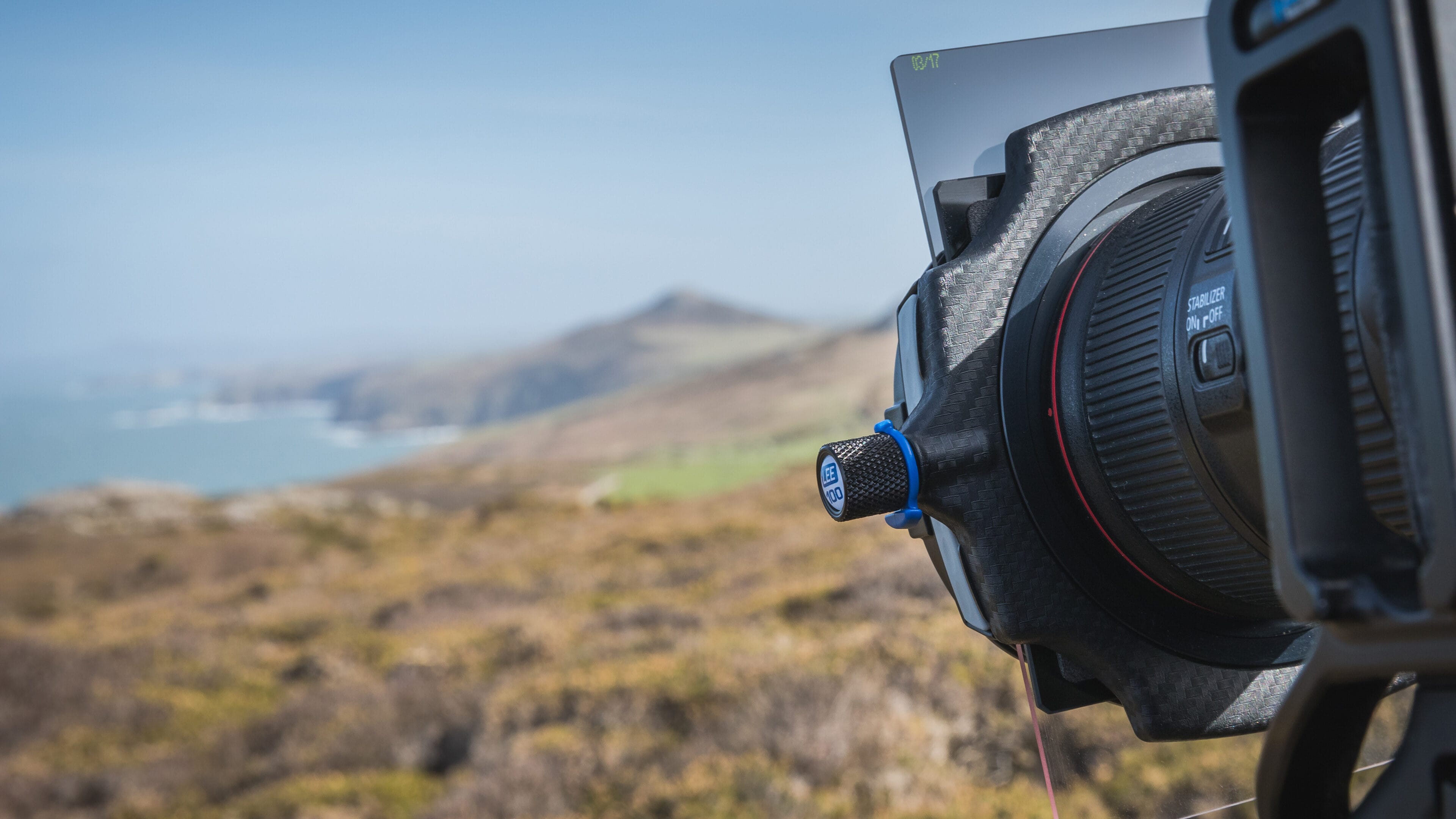
LEE100
The LEE100 System can be configured to hold up to four 100mm camera filters (our standard width) for unparalleled creative freedom. This system incorporates features that make using camera filters quicker and more intuitive than ever.
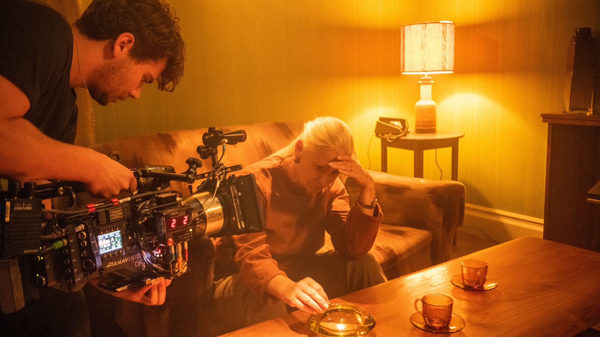
ProGlass CINE IRND
Our ProGlass Cine range of neutral-density filters has been designed to meet the exacting needs of all cinematographers — whether shooting digitally or on film. They are remarkably neutral, eliminating infrared pollution and ensuring all colours remain absolutely accurate and true.
Discover the best of LEE camera filters
Our system match tool
Use System Match to locate your camera lenses and discover which of our three filter systems we recommend for each lens. You’ll also learn exactly which adaptor rings you’ll need to get started.
Filter by camera brand, model, type of lens and focal range.